A List Apart Needs a Redesign — IMHO
I love A List Apart. The publication has always set the standard, in my view, for solid web publishing, standards, practices, methods, and tutorials with clear navigation and clean, readable design.
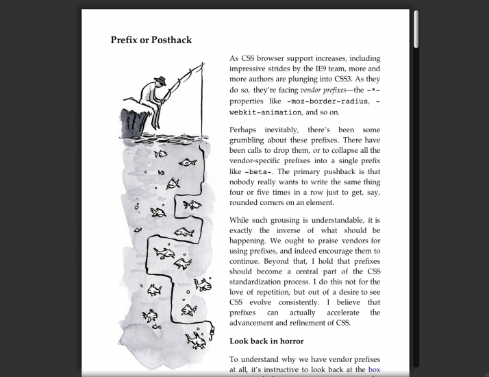
I don’t know it’s the prevalence of other reading devices in my life (iPhone, iPad, Instapaper, Google Reader) from which I consume a lot of my news, aging eyes, or just a new outlook, but, the article is immensely more enjoyable and easier to read in Safari 5’s new “Reader” view which puts an article into an Instapaper or Readability format. If you haven’t seen the two sites I mentioned you should check them out, they both provide a better reading experience when reading news on any device, Instapaper has a nice mobile and iPad client app too.
I hope the simplification of the page continues in the A List Apart tradition… after all it definitely had a great start with some redesigns on that site.

A List Apart Article in default view

A List Apart Article in Safari 5 Reader view